The web site pagetutor.com put up an excellent illustration of what 1 trillion dollars looks like. The original site is here: http://www.pagetutor.com/trillion/index.html
I excerpted the post here to help illustrate how much the United States spends on health care.
What does one TRILLION dollars look like?
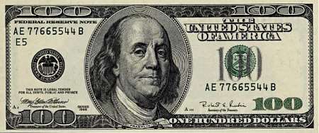
We’ll start with a $100 dollar bill, currently the largest U.S. denomination in general circulation. Most everyone has seen them, slightly fewer have owned them. Guaranteed to make friends wherever they go.
A packet of one hundred $100 bills is less than .5 inch / 12.7 mm thick and contains $10,000. It fits in your pocket easily and is more than enough for week or two of shamefully decadent fun.

Believe it or not, this next little pile is $1 million dollars (100 packets of $10,000). You could stuff that into a grocery bag and walk around with it.

While a measly $1 million looked a little unimpressive, $100 million is a little more respectable. It fits neatly on a standard pallet…

And $1 BILLION dollars… now we’re really getting somewhere…

Next we’ll look at ONE TRILLION dollars. This is that number we’ve been hearing so much about. What is a trillion dollars? Well, it’s a million million. It’s a thousand billion. It’s a one followed by 12 zeros.
Ladies and gentlemen… I give you $1 trillion dollars…

In 2008 the United States of America spent $2.4 trillion dollars on health care. That equals 2.4 times this graphic.
The current unfunded liabilities (meaning the U.S. is committed to spending the money but has no way to pay those obligations) for Medicare total $85.6 trillion. That equals 85.6 times this graphic.
The crisis related to health care spending in the United States is real, it is just sometimes very challenging to visualize. In this case, each one of us is that man in the red shirt in the lower left corner of the graphic. We face a challenge 2.4 and 85.6 times the pallets of money illustrated in this graphic. And that is a lot of $100 bills.
That’s a pretty impressive visual, but it’s also misleading. 1.6 trillion over 10 years,while it seems big by itself, it’s actually a small amount of what has been spent on health care in the last 10 years. in 2007 alone $2.26 trillion was spent on health care in the US (premiums plus out of pocket expenses). And that was not over 1o years that was just 2007.
Over the next 10 years, that total is expected to be $40 trillion because currently health care spending is rising much faster than inflation.
Not only is it a drop in the bucket, but if we pass those reforms the total amount needed to pay for health care will go down, because the public plan will negotiate lower prices than the private insurers do, because it has economies of scale.
The next thing you hip out the ol’ pallets of money, please give people some context otherwise, you basically pulling an unfair scare tactic.
Chrisfs,
Please read the post again. The post clearly states “In 2008 the United States of America spent $2.4 trillion dollars on health care. That equals 2.4 times this graphic.”
If you are looking for context, please check the other posts on this blog relating to health care reform:
http://autopsis.com/2009/03/12/thoughts-on-health-care-reform/
http://autopsis.com/2009/03/13/health-care-reform-faq/
http://autopsis.com/2009/03/13/health-care-reform-the-options/
http://autopsis.com/2009/03/19/health-care-reform-the-cost-drivers-one-academics-view/
Doug
Pingback: Autopsis » Blog Archive » Health Care Reform, the Napkin Version